Tuesday, January 27, 2009

final: Emotional Psychology


My photographs represent the emotion that can be found in a psychological matter. Therefore, I titled my pieces according to the moods that people feel and relate to in everyday life. I hope to earn a degree in psychology and thought that this would be way to incorporate “me” into my artwork. Each photograph was taken in a similar setting as a way for me to unify my exhibit. I also used color to symbolize what each picture meant to me. My editing simply consisted of color balancing, heightening contrast, and fixing any apparent blemishes. My piece titled “Intimacy” portrays the way many people long for something or someone. The pink necklace is a subtle version of obvious color symbolism. In “Repression” I really wanted to emphasize the built up feelings that are kept inside of a person. My model is struggling to express her feelings, but also wants to let go of them. “Narcissism” is arrogance taken to the next level, and can be a big problem in the lives of some. When self-love and the lack of consideration of others are combined, a person starts to become unhappy with who they truly are. My photograph representing “Altruism” gives off daring vibes. Without even measuring consequences, one may not see the dangers they can put themselves in. Finally, “Ambiguity” reflects the way that decisions play into one’s life. Choices are made everyday and uncertainty is often tied in with one’s anxieties. I am mostly pleased with my work and I hope you can relate to what you have seen, if not formed your own interpretation!
Thanks to models: Michael S, Ashley B, Lenny J, Haley FM, Greg N

Thursday, January 15, 2009

this week's assignment: back of my head


i like the way that my living room image looks like it is from my head's point of view. the composition isn't the greatest, but it kind of makes sense in this case. in my other photo, i was experimenting with lighting on my hair, and also the angle i took the picture from. i wanted it to look like i was going down the stairs (i was). plus, i like the way you can see into other rooms. that's about it for these.

this week's assignment: flashlight


my flashlight pictures have obvious focal points because my flashlight is not very strong, but i tried to make that a good thing.... in my orangeish image, i took a picture of those candles that are suspended/connected on a string (can't remember what they're called). I like the lighting gradient, but i suppose it could also be a bit boring. my other image is a "macro" of a sweater. i like that there is texture and that the lighting runs on a diagonal. there are also little bits of color in the fabric that i like.

Wednesday, January 14, 2009

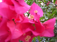
This Week's Assignment: My Favorite Color


I really like the color red. I think that it has the ability to be strong and soft at the same time. It can represent love, blood, or independence, it just depends. I took this picture because the flower thing (?) reflected lots of light and also has orangish highlights. I like the composition for the most part.

this week's assignment: 5 of the Same


i decided to take pictures of candles, mostly because we have a lot of different kinds, but also because most of them were in well-lit spots in our house and were melted into interesting shapes. i really liked how the greenish one with the match turned out. i tried to get a few different angles and lighting of the candles as well.


Friday, December 19, 2008

clothing advertisement: film


i took this picture planning on advertising the dress, but i feel that it better showcases the scarf. i think the pose is somewhat high-fashion, but i wish that the print turned out better, as the film turned out really good. plus, it doesn't look as good scanned.


the second picture is posted more for fun, it was an alternate shot that advertises the dress better (it looks like she's having fun too), but the print itself was a bit blurry and darker than i would like.

Thursday, December 18, 2008

tv show, color/digital


this is my least favorite of the assignment. i had a really cool idea for a teenage drama about a guy who couldn't decide between two girls and one got hurt and so on....but i could not find enough models.
my 'new' drama is about a single father who finds out that his teenage daughter ran away. he appears frustrated, but is also worried, he remembers times when he had a better relationship with her.
i saturated this picture a little and took some of the shine out of his face. i wanted the picture kind of dark so it resembled a teenage drama.

black and white digital: political


i think that there are a lot of issues and controversy that drug and alcohol-related problems create in our society. i took this picture to represent the way a drug user or alcoholic must feel after rough times during their life. even though lots may be going on around them, they feel stuck in their own time, so i decided to put my model in a whirlpool with newspapers to show this. they also feel alone and empty, so basically i went for a lot of symbolism, which may not convey my message as strongly, but i think it is pretty decent in my mind.
i could made this image stronger with more contrast, but i do think that there are enough tones from black to white.

Friday, December 12, 2008

b&w


The photo i took of the crystal glass is interesting because of the detail it has and contrast in the textured areas. i like the composition of the photo, but i think it could be better.
My tree photo has lots of intricacy and i like the contrast and movement of it. i wish it showed more depth though.

Wednesday, December 10, 2008


these are my three winter, color images. in the first one i lightened everything and chose to take the picture while the sun was about to go down because i liked the way the light was reflected from the snow and makes it look a bit yellow.
my second and third photos look a bit like there is a candle light and i like that. their focal points are exaggerated by the source of light, but they are still able to convey cool tones overall. i like the composition and colors i used, but i would like them to have better contrast. that's all right now.

Friday, December 5, 2008


In this image I used backlighting to strengthen

the tree's branches as focal points. i took it close up to capture the detail. On Photoshop I color balanced it.

For all of my images I used advice/tips from a website and magazines.


i took this picture to showcase my step-dad's

personality as well as the texture of his had. i edited the whites of his eyes and color balanced to image to improve it. i wanted it to be more of a macro portrait too.

snow white


The technique i used for this photo was all about people in their natural environment. I took this picture of someone who enjoys dressing up, but can also be shy at times. i color balanced it and edited some of the background as well. I also like that the snow and 'snow white' correlate.


Monday, December 1, 2008

Monday, November 17, 2008

equivalence


this image is representative of my 'analyzing qualities.' just like the image shows, things can be looked at both as complex and simple at the same time. the lighting came from the left side of the picture and creates a gradient as the eye moves from the left to right. i didn't do a lot to this picture except cropping it while in photoshop.

equivalence


this picture could represent one of two things about me. what i was trying to get out of this photo was stubbornness, but i also got a longing feeling out of it at the same time. i think that both the colors and lighting used help symbolize what i was going for. i used a studio kind of lighting(hallogen?) to create a focus on my model. I also chose a green shirt to contrast the white background. I like that there is texture that is not too distracting, but brings movement and is less boring than a traditional solid color.

Friday, November 14, 2008

equivalence


this picture is the 2nd in my series. it is representing the part of me that is inspired and idealistic. sometimes it is nice to be an optimist, but too much of this at one time can also be one of my downfalls. i think that sometimes i get my hopes up too much or find myself longing for something that may never happen. luckily, keeping an open mind can also bring strong imagination.

equivalence


my first photo representative of strength and leadership. my whole project is symbolic of a weak, and a strong trait that i carry, as well as two that can be taken both ways (beneficial and disadvantageous). 
like i said, this photo is supposed to be strong, which is why i chose red; it especially stands out with the highly-contrasted green background. i edited a lot of the background as well as "upped" the saturation.


Sunday, November 2, 2008

"holgas"


i originally wanted to do some holgas involving strobe lights; after numerous attempts at this, i decided that using the fireworks setting on a digital camera would be much more beneficial. these are some of the things i have come up with.

Wednesday, October 15, 2008

Montage #2


This montage is more in-touch with nature. I used paint and both digital and darkroom photos again. I also added a woven magazine picture of a butterfly and something abstract.